Search This Blog

Showing posts with label Ology. Show all posts

Thursday, April 22, 2010

Wednesday, April 21, 2010

Tuesday, April 20, 2010

Seth Aaronology

Seth A, step up to the judging circle, please.

Click for full post.

If you're having display issues with your feed, subscribe to our new feed

Wednesday, October 15, 2008

Kortology


Children, the word for today is "uneven." Not the quality of the work, mind you. She's no less even in the quality of her work than the other contestants. No, we mean it's uneven in the sense that there's no overriding aesthetic or through-line for her work. We guess one could spin that as a wide range but the fact is, in order to declare that one has a wide range one would have to demonstrate quality in all their work. Like we said before, when she's good (1,5,6,7,8,10), she's really good but when she's bad (2,9,12), she's really bad. To her credit, there are more good looks than bad but she's all over the place in terms of her style. If we must be armchair psychologists (and you know we must), we'd have to say that she was a little lost during the competition and trying too hard to please the judges instead of following her own muse. This might explain why their criticism had a tendency to make her cry.

Another credit to her is that she really attempts to do something different almost every time, whether it's a kimono, a shark fin dress, pants and a vest, a coat, blouson sleeves or a big glittery flame flower on a drag queen.

There aren't really any themes to her competition work. We thought "volume" and "ethnic" were her touchstones but looking over this, that's not really true. There were only two looks with an ethnic flair (1,5) and while there is quite a bit of volume (1,5,6,9,12) there are as much or more fitted pieces (2,3,4,7,8,10). Color-wise, she tended toward yellows and reds but not so much that it was a motif. Another slight theme is the vest or jacket (2,4,5,7,8,10), which she returned to several times.

In the end, she was an erratic contestant, more so than we realized, who demonstrated enough talent and style to get her to the end. We're glad she's there because we really do like her work but looking at this collection we have to say she was lucky a couple of times too.

[Photos: Barbara Nitke/Bravo]

Tuesday, October 14, 2008

Kenleyology


Children, the word for today is "bold." Bold colors, bold patterns, bold silhouettes. Like her personality, Kenley's designs are loud and brash. You know what's not the word for today? What never should have been the word for Kenley? "Retro." Looking over her entire output for the season, we can't seem to find many examples that could rightfully be called retro. Sure, it's a flavor in her work (4,6,7,9) but it's not the overriding aesthetic.

Much like Laura Bennett in season 3 (and believe us, that'll be the last time we compare the two), Kenley's own personal style overwhelmed whatever she was putting down the runway. Kenley dresses retro but she doesn't always design retro. In other words, people were looking at what she was wearing and not what she was designing.

No, the true through-line for her work is silhouette. More than any other designer this season - even Korto, who's "known" for it - Kenley played around with silhouettes. Whether it was an unusual skirt (1,3,6,8,11) or collar (2, 5) or even sleeves (8), Kenley likes to play around with and play off of the female form. It doesn't always work but we particularly like her Gristedes dress (1) and her "green" dress (2). In fact, looking over this collection, we're surprised to admit how much of it we liked. She seemed to get weaker as the competition progressed but that's not all that unusual.

Color-wise, she clearly likes to work with bold ones, particularly pinks and purples. As for prints, we've gone on the record as saying that we don't like the ones she picks and this collection isn't doing anything to change our mind. Certainly, the vibrant, '80s-inspired prints are back in style but that doesn't mean that she did a good job of picking the right ones.

So, looking at all this, what can you expect from her Bryant Park collection? Bold silhouettes, bold prints, pinks and purples and a slightly retro vibe. We'll say one thing for her: she's consistent.


[Photos: Barbara Nitke/Bravo]

Monday, October 13, 2008

Leannology

Darlings, now comes one of our favorite parts of every season: the "ology" posts. This is when we look at the entire output of each remaining designer to see if we can find some common themes and make some predictions about their runway show. Of course, we've already seen her runway show but don't worry, we won't spoil anything. First up: Leanne.


Children, the word for today is "noodle." Although to be fair, she only got noodle-y with looks 2,3, and 8. A more accurate term would be "pleat." Judy loves her some pleats and sometimes it works (5, 6, 11) and sometimes it really doesn't (1 - dear God, we forgot about that one).

Going by this, we have to say she tends toward, and is most comfortable working in, classic, feminine sillhouettes with pleating or ruffles as embellishments (2,3,6,7,11). When she's forced outside her comfort zone, whether by materials, client, or aesthetic (1,2,5,8,9,10) she falters and the work is largely uneven. The pleating on the drag dress was fun and interesting but the dress itself was too severe, the "green" dress (2) was just a disaster, as was the country look (10). The makeover dress (9) was dull and suffered from too many client restrictions. The one exception to this was the "Saturn" dress (6). That was a rare instance where she was forced out of the box and still managed to knock it out of the park. Strangely, it was also an instance where she produced a highly unusual silhouette.

She clearly doesn't like prints and she tends toward blacks, reds and blues as her color choices. She's capable of cute, sporty looks (4), but her obvious love is for dresses and gowns. Along with the aforementioned Saturn dress, her best looks by far were the "nightlife" dress (3) and the DVF dress (7).

What does this all mean? Well, it can mean whatever you want it to, really. For us, it means she works best in a somewhat narrow range. Her best work is classic and simple with just enough of a twist to make it interesting. She has something of a weakness in the color area and we would like to see her dabble in prints to push herself a little. If we had to sum her up, her intellectual approach produces some truly beautiful pieces but there's a potential for painting herself into a corner and her work can sometimes be a little too ponderous, bordering on depressing if she's not careful.

And the girl just loves her noodles.

[Photos: Barbara Nitke/Bravo]

Saturday, September 30, 2006

Laurology


Okay, we admit it.

When we saw where Laura was heading, we were underwhelmed. Granted, "wow the judges" is about as articulate a design challenge as "make something pretty," but we were afraid that "doing what I do, better than I've ever done it," while plucky, probably wasn't what the judges wanted to see.

On the one hand, we were right; on the other hand, so was Laura. She didn't win it, but it seemed that she made a conscious choice to produce something that she knew would get her to OFW and lo and behold, it did. Her mama didn't raise no fool.

As for the dress, it's beautiful and probably one of the most perfectly executed garments in all 3 seasons of the show. While we agreed somewhat with the judges that Laura needs to widen her point of view slightly, we also think they overstated the point.

For one, up to now, Laura has not had any professional experience in fashion, which means she's never produced a collection. That she is focussed on a particular aesthetic right now doesn't necessarily mean that she only has one point of view.


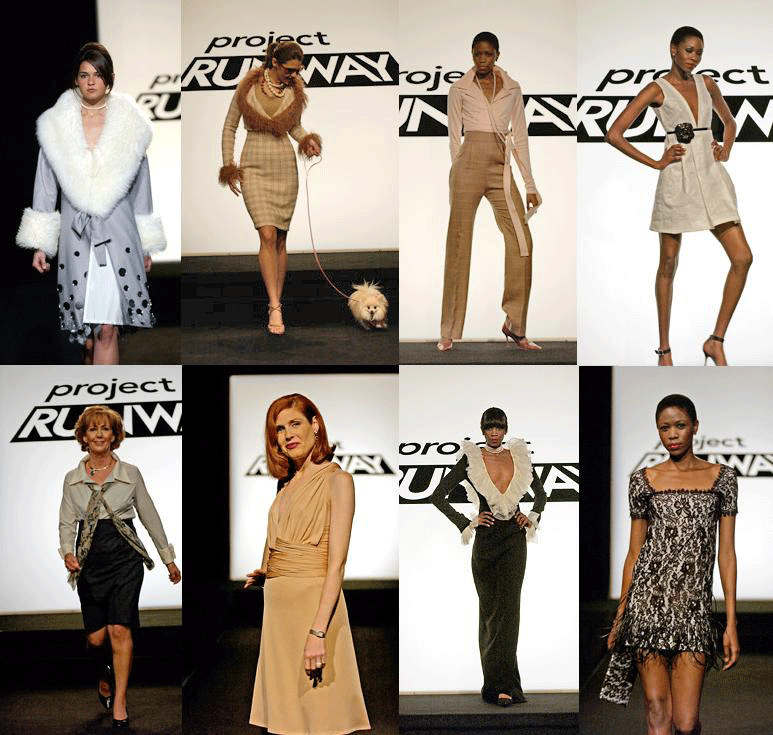
Second, we started thinking about it and realized she's not as repetitive as some (including us) have been saying. Look at what she's produced during the competition:


For all the talk from the Duchess of never wanting to see another one from her again, she only ever produced two garments with what could be called "plunging" necklines. Looking at her garments all together like this, it's interesting how much it looks like a collection. She has a concise point of view and there are certain design elements she returns to again and again (lace, beading, "exuberant" collars), but she doesn't make the same dress over and over and she doesn't design only for herself.

As a point of comparison, look at Uli's competition work:


There 's a hell of a lot more similarity of form going on there. Ironically, even though this grouping is far more repetitive, it somehow looks less like a collection than Laura's does. We don't mean to be ragging on Uli. She also has a strong point of view that she executes masterfully, so it's practically inevitable that she and Laura get compared so often.

It struck us that part of the reason the "narrow" placard gets hung on Laura's neck has as much to do with what she wore during the competition as it did with what she produced for the competition.


That's a consequence of having a strong point of view and the force of personality to consistently and fabulously express it, which our girl has in spades. Right Laura?


"Fuck, yeah!"